Here’s a narrative on the progress of my project. As I’m sure many of you already know, my interest is in somehow displaying jazz album cover art, as in a visualization, or a in some kind of new way of seeing things. My creative ideas have been seriously bogged down in the nuts and bolts of using software and tools, and I’ve found that there is no magic bullet (that I know of, at least) to automate the assembly of my images and the collecting and cleaning of meta data.
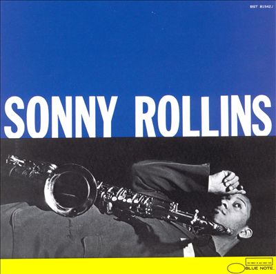
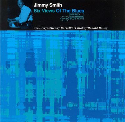
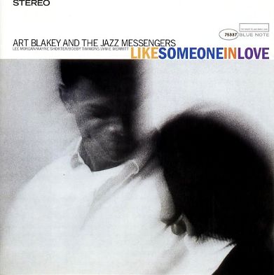
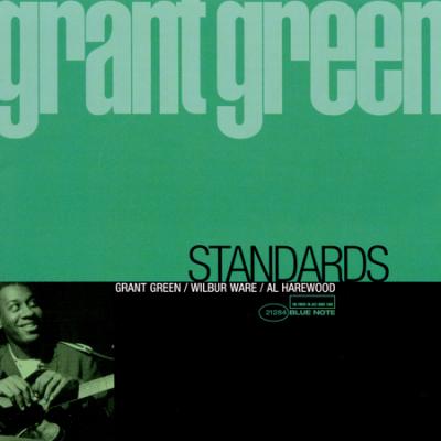
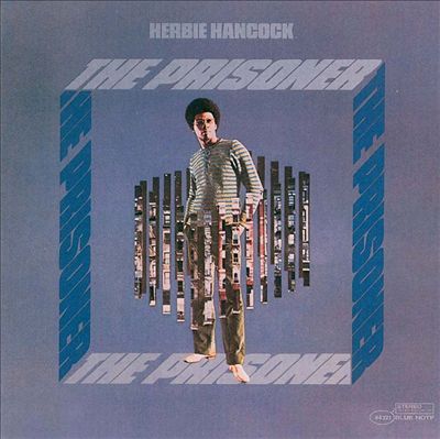
My first task, of course, was to assemble my sample images, which are sixteen hand-picked images from the hundreds of Blue Note Album covers out there. I chose them because they represent, to my eye, some of the different styles and types of album covers that have made Blue Note Records a favorite of many jazz afficianados (not to mention the music, of course, which is a whole other universe, but which is related to the artwork). So, after much tinkering and tweaking, here is my sample image file:

OK, just so we can look at them individually, here they are:


Now, the next step is to create a spreadsheet with some corresponding data about the images. Hopefully, this will enable me to play with them in ImagePlot. Also, I will need to convert the file to a .txt file, preferably tab delimited, to play with it in Mondrian. This process, unfortunately, is being done manually, so it may take some time. Here we go.
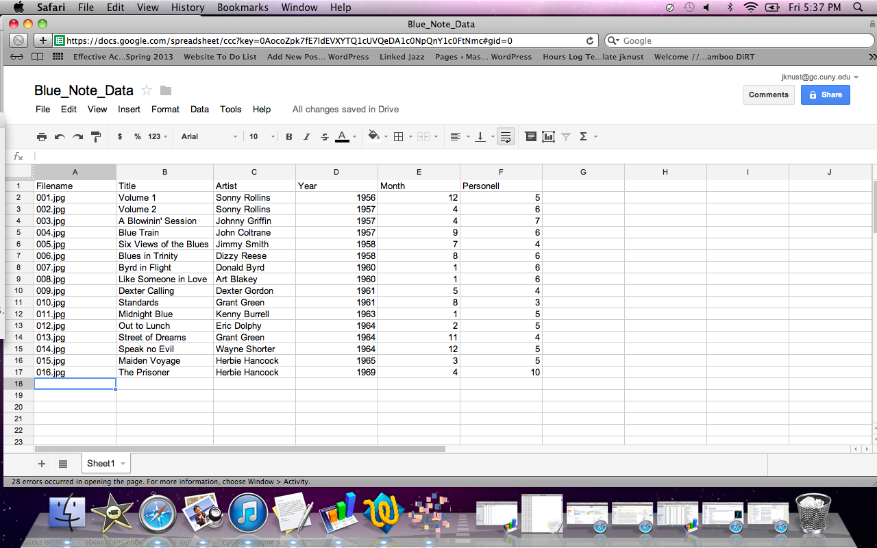
OK, not to bad, about forty minutes, since I already assembled the data by hand.
One frustration I had was discovering that there is no way to save, convert, or export a file from Numbers, Mac’s proprietary spreadsheet program, as a tab delimited file. OK, I got around that by using Google docs, which opened the file in R, from which I could save the file in my preferred format, but it cost me some time.
Now, I’m going to try my data set in Mondrian, and see if it will work.
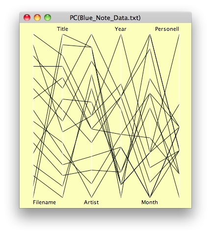
Great. It works! This plot is Parallel Coordinate of all data. Interesting to look at, but it doesn’t really tell us anything. Not that I really expected it to, with such a small data sample, and with samples that were hand picked based on personal preferences, but it tells me that all systems are go, and that I successfully passed this checkpoint.

Above is a Scatterplot Matrix, which, again, does not show show anything other than that it works. With a very large and complete data set, say 200 images, there could be some surprises.
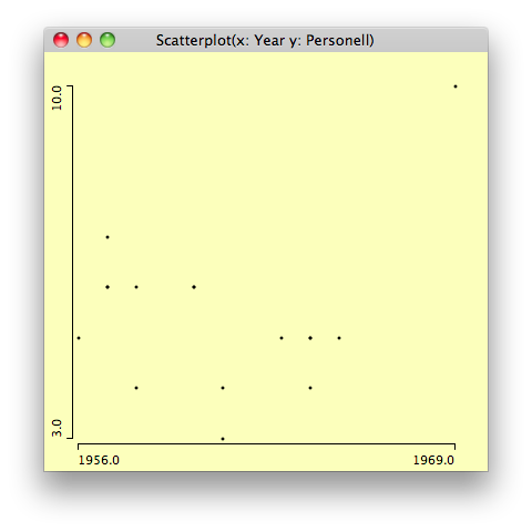
Above shows the x-axis as year and the y-axis as the number of musicians on each album. If this were a large and complete sample, we might note the gradual downsizing of groups over time, with 1969 being the outlier. We might tag the sextet as the dominant group size early on, and the quintet taking over in the early 1960s. The quartet would be seen as a steady format. With the sample I have, of course, we cannot infer anything. This is just a test run.
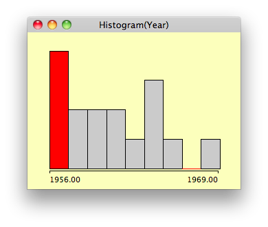
What this Histogram says is that the biggest year for album covers which I personally liked, choosing 16 out of hundreds, was 1956, which also happens to be the year after Blue Note started using Reid Miles to design their album covers. He stayed on for around 12 years, creating hundreds of designs, and helping Blue Note Records to achieve a unique brand identity.
I don’t want to spend too much time in Mondrian, as I must now attempt to run ImageJ and ImagePlot with my sample.
Ok, first attempt failed to load all but two images failed. Why? Because, despite their being all 12″ album covers, and all downloaded from the same source, they were not all the same size. Some were off by only a pixel or two, but they all need to be resized.
Hooray! After two more attempts, the images loaded. Now, let’s see if we can do anything.
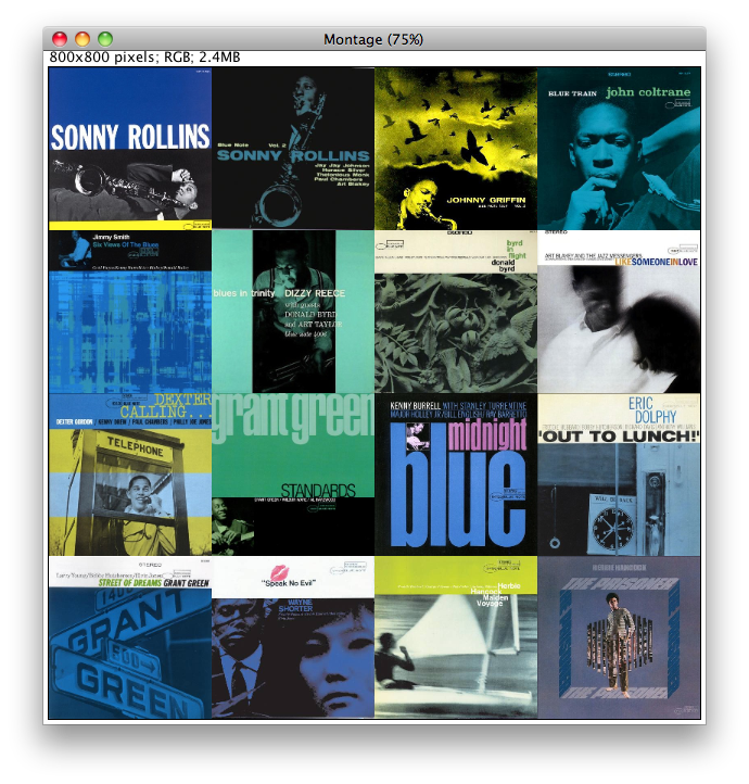
This is the Montage feature.
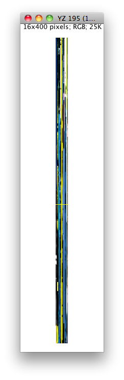
This is a vertical slice, from the center of each image. Hard to see much, but as the number of images increases, of course, there will be more to see. If the images are arranged chronologically, we might see any patterns or changing trends over time.
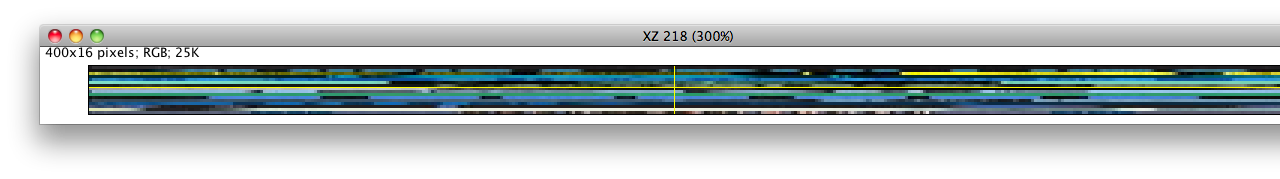
Ditto for the horizontal slice.
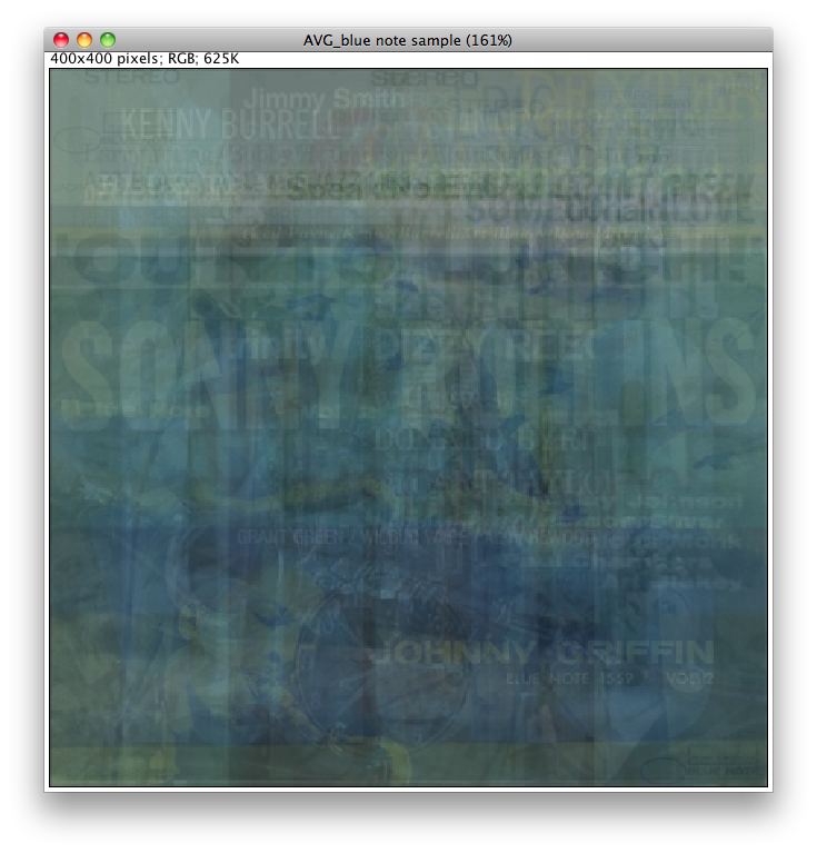
Here’s where it really starts to get interesting–all the images superimposed, showing average intensity.
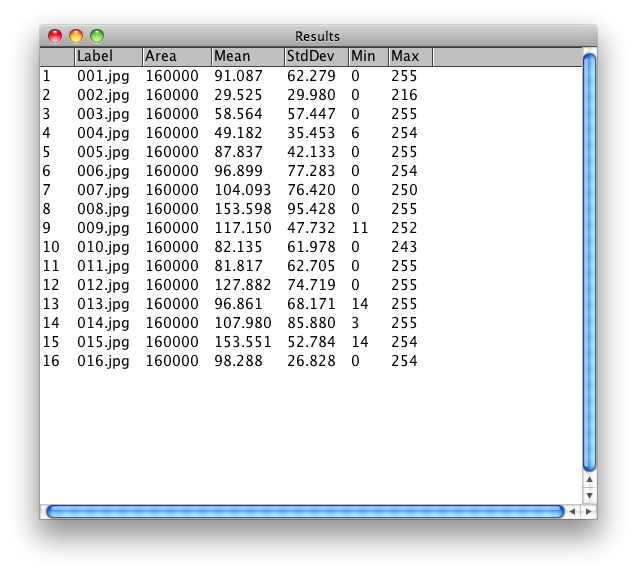
This is the result of a measurement of the grey-scale values for each image. These values can be used to resort, reorder, and display the images according to these values.