Visualizing Blue Note

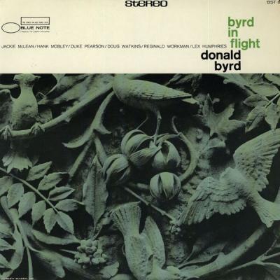
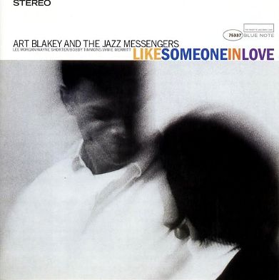
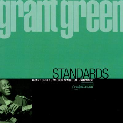
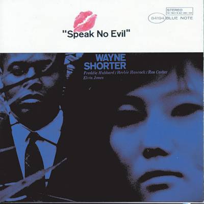
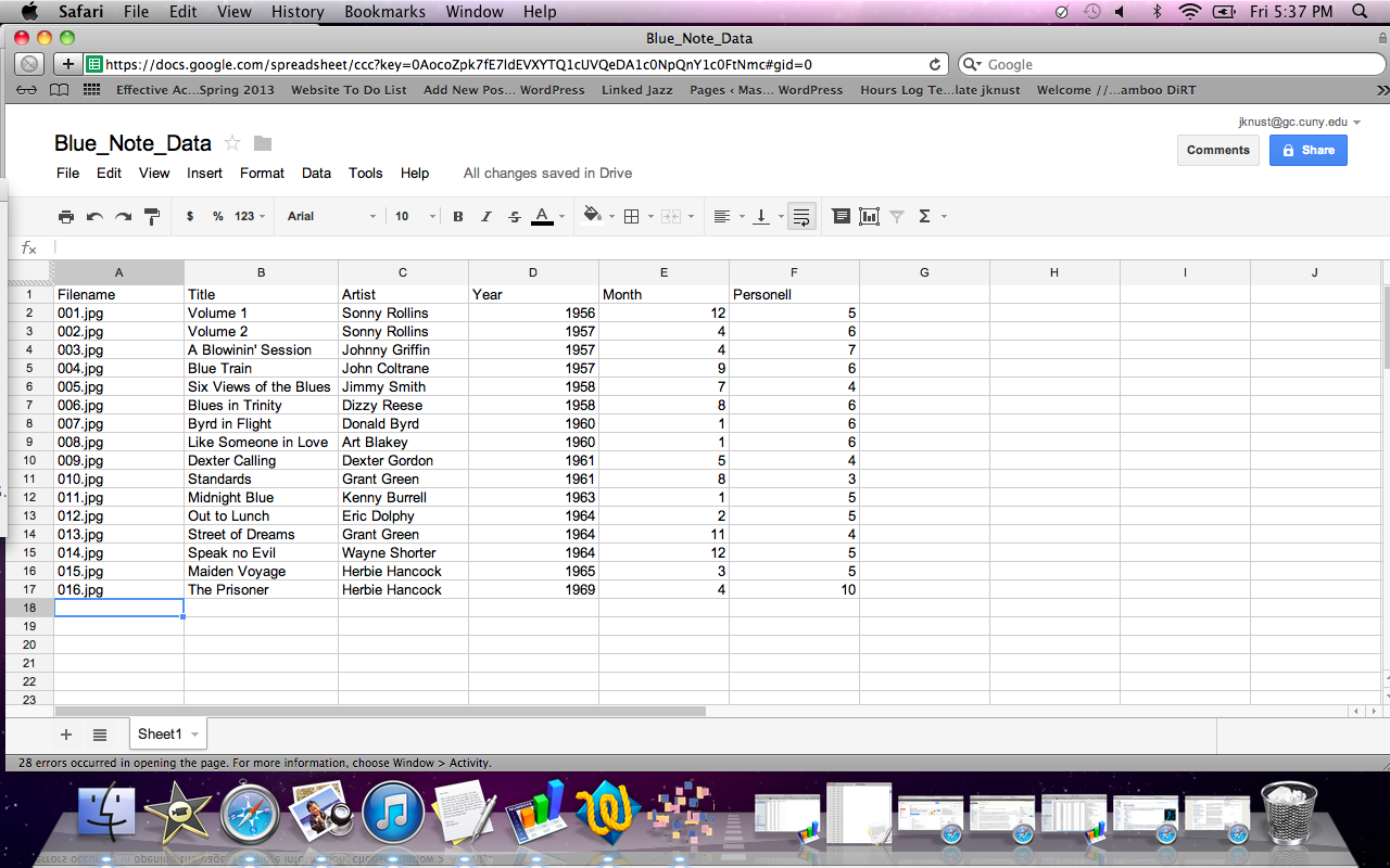
In my last post, I detailed a dry-run using a data set of sixteen images.  I have now expanded the set to 42 Blue Note album covers, spanning from 1956 to 1969, with most of them from the late 1950s, to early 1960s.  The work has been time-intensive, as, again, everything has been done pretty much by hand, from collecting the images and resizing them, to entering basic metadata into a spreadsheet.  Far from making any earth-shaking discoveries at this point, my work thus far is best seen as a set of experiments–a work still in progress.

My rationale for undertaking this particular project is to examine the visual culture of jazz in a new way.  Jazz itself, as a musical art form, has been studied and analyzed a great deal, as has its cultural impact.  But the visual elements of jazz art, wholly apart from the music itself, seems to be an area ripe for new research.   By examining jazz album covers as cultural icons in large data sets, some interesting features may present themselves.

Jazz can be seen as a pre-digital open access collaborative venture which foreshadows the new forms of scholarship emerging under the Digital Humanities banner.  As an art form in which both individualism and collective improvisation flourish, jazz both reflects and influences the culture in which it resides.

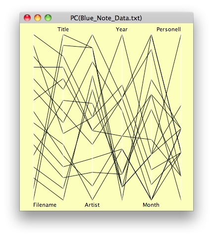
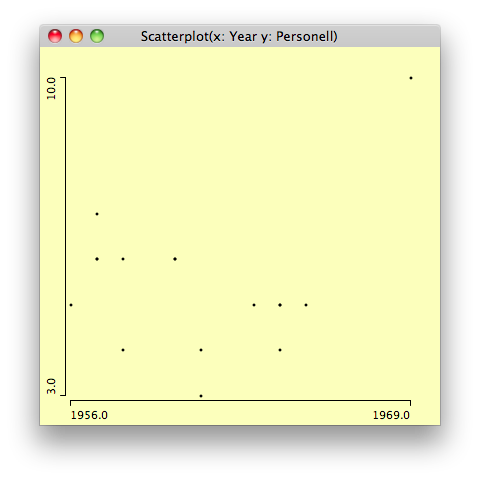
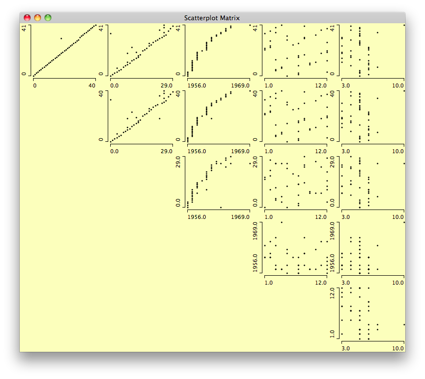
Let’s start with our expanded data set.  Again, interesting to look at, but not much can be made of it.

Screen shot 2013-05-27 at 8.18.59 PM


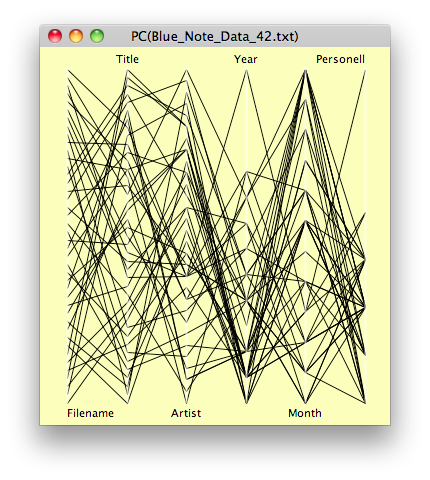
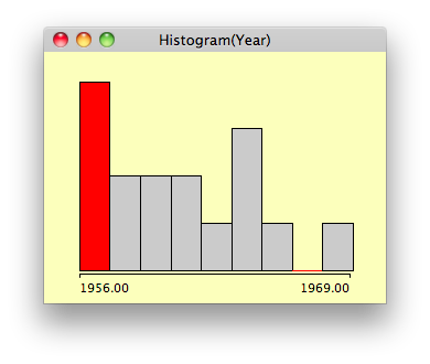
Here’s another view from Mondrian.  Again, no surprises, but everything seems to work.

Screen shot 2013-05-27 at 8.28.36 PM


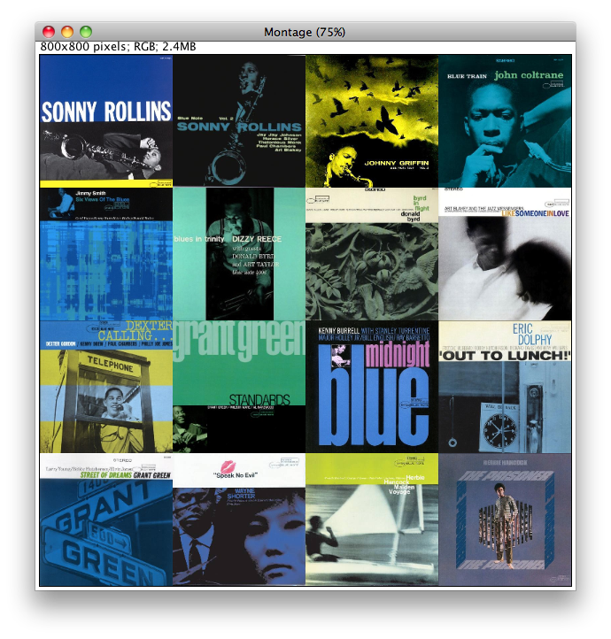
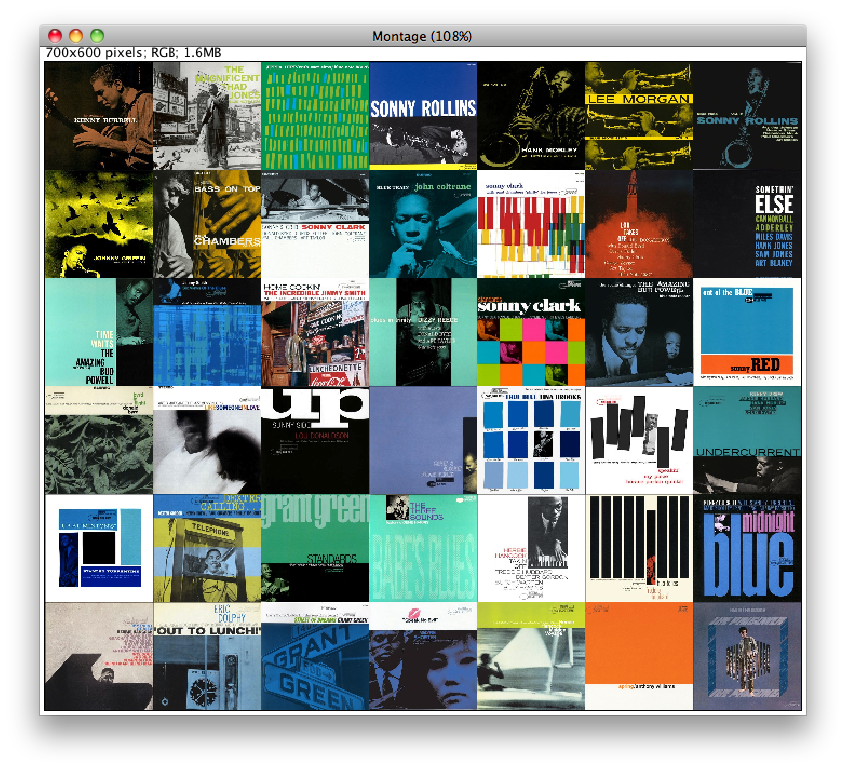
Though I made a great many plots in Mondrian, I feel compelled to move on to the images themselves.  First off, this is the image montage, arranged chronologically:

Screen shot 2013-05-27 at 8.43.20 PM


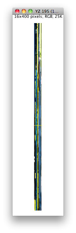
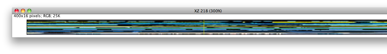
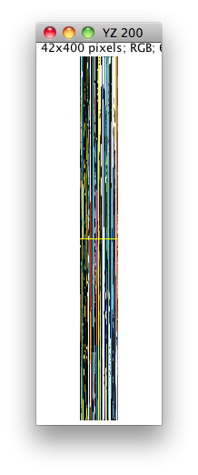
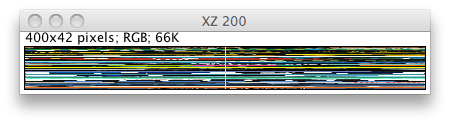
Next, we can view the image slices, both vertical and horizontal:

Screen shot 2013-05-27 at 8.45.37 PM


Screen shot 2013-05-27 at 8.46.04 PM


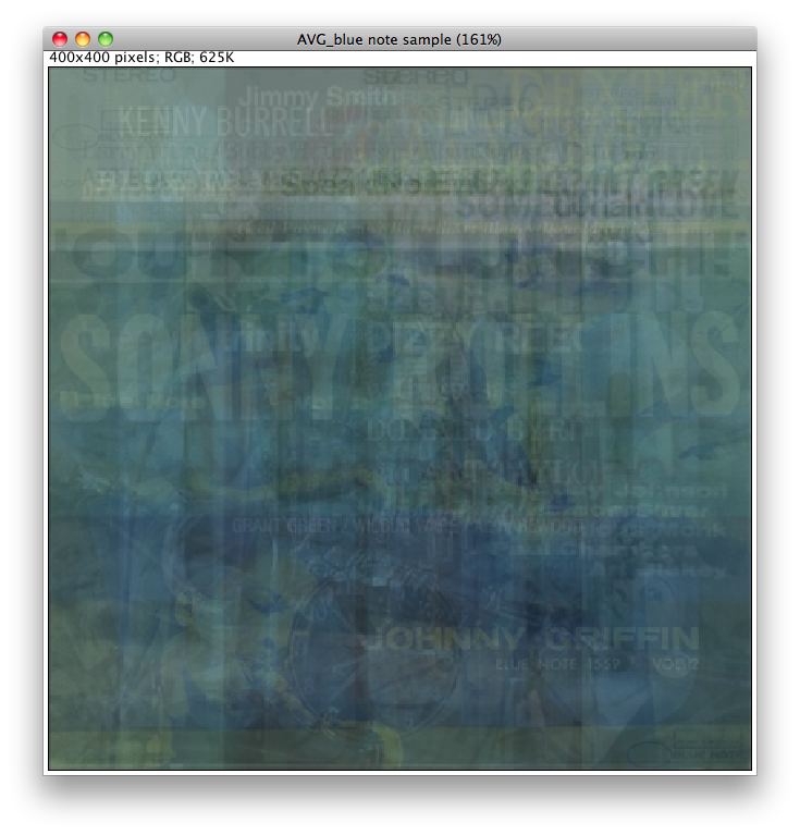
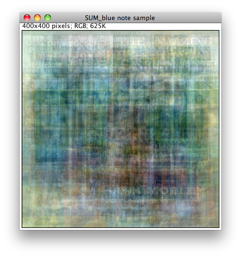
Next off, and really quite interesting, is all the images superimposed.  This is based on the average intensity:

Screen shot 2013-05-27 at 8.49.04 PM


Next one is maximum intensity:

Screen shot 2013-05-27 at 8.50.16 PM


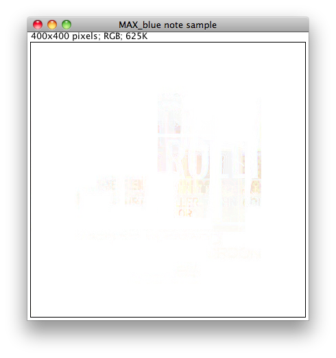
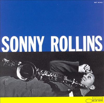
Somehow, Sonny Rollins shines through.

This next one I find quite beautiful:

Screen shot 2013-05-27 at 8.51.17 PM


It really stands alone as a work of art.  Hank Mobley shows through here.

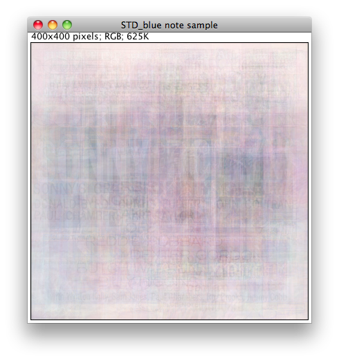
Standard deviation creates a pastel effect:

Screen shot 2013-05-27 at 8.52.20 PM


Median intensity creates a very interesting effect:

Screen shot 2013-05-27 at 8.52.58 PM


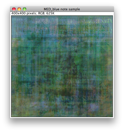
This is perhaps my favorite, as it shows the predominance of blues and greens throughout.

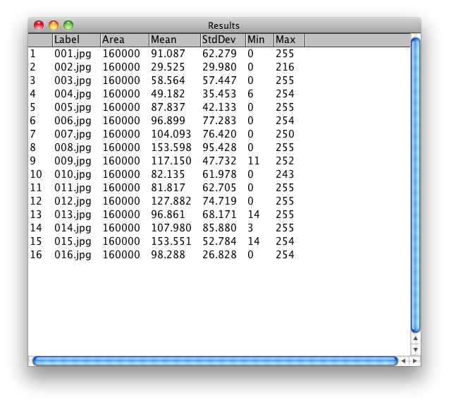
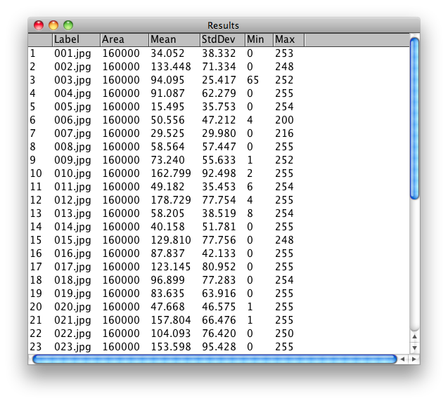
I got just to the point of measuring for different values, especially grey scale values:

Screen shot 2013-05-27 at 9.15.20 PM


As my work continues, I would like to be displaying the images based on these measurements, as well as hue, brightness, and other factors.  As it stands, this is as far as I’ve been able to take it up to now.  Ideally, I would also have a much larger image set to work with as well.

Ultimately, it would be interesting to compare sets of images from different jazz labels as well, such as Impulse, Columbia, and others, especially from this time period of late 1950s to mid 1960s.

Final Project

Here’s a narrative on the progress of my project.  As I’m sure many of you already know, my interest is in somehow displaying jazz album cover art, as in a visualization, or a in some kind of new way of seeing things.  My creative ideas have been seriously bogged down in the nuts and bolts of using software and tools, and I’ve found that there is no magic bullet (that I know of, at least) to automate the assembly of my images and the collecting and cleaning of meta data.

My first task, of course, was to assemble my sample images, which are sixteen hand-picked images from the hundreds of Blue Note Album covers out there.  I chose them because they represent, to my eye, some of the different styles and types of album covers that have made Blue Note Records a favorite of many jazz afficianados (not to mention the music, of course, which is a whole other universe, but which is related to the artwork).  So, after much tinkering and tweaking, here is my sample image file:


Screen shot 2013-05-10 at 4.44.32 PM

OK, just so we can look at them individually, here they are:

001 002 003 004 005 006 007 008 009 010 011 012 013 014 015 016


Now, the next step is to create a spreadsheet with some corresponding data about the images.  Hopefully, this will enable me to play with them in ImagePlot.  Also, I will need to convert the file to a .txt file, preferably tab delimited, to play with it in Mondrian.  This process, unfortunately, is being done manually, so it may take some time.  Here we go.

Screen shot 2013-05-10 at 5.37.39 PM


OK, not to bad, about forty minutes, since I already assembled the data by hand.

One frustration I had was discovering that there is no way to save, convert, or export a file from Numbers, Mac’s proprietary spreadsheet program, as a tab delimited file.  OK, I got around that by using Google docs, which opened the file in R, from which I could save the file in my preferred format, but it cost me some time.

Now, I’m going to try my data set in Mondrian, and see if it will work.

Screen shot 2013-05-12 at 5.56.02 PM


Great.  It works!  This plot is Parallel Coordinate of all data.  Interesting to look at, but it doesn’t really tell us anything.  Not that I really expected it to, with such a small data sample, and with samples that were hand picked based on personal preferences, but it tells me that all systems are go, and that I successfully passed this checkpoint.

Screen shot 2013-05-12 at 6.05.40 PM


Above is a Scatterplot Matrix, which, again, does not show show anything other than that it works.  With a very large and complete data set, say 200 images, there could be some surprises.

Screen shot 2013-05-12 at 6.13.19 PM


Above shows the x-axis as year and the y-axis as the number of musicians on each album.  If this were a large and complete sample, we might note the gradual downsizing of groups over time, with 1969 being the outlier.  We might tag the sextet as the dominant group size early on, and the quintet taking over in the early 1960s.  The quartet would be seen as a steady format.  With the sample I have, of course, we cannot infer anything.  This is just a test run.

Screen shot 2013-05-12 at 6.31.35 PM


What this Histogram says is that the biggest year for album covers which I personally liked, choosing 16 out of hundreds, was 1956, which also happens to be the year after Blue Note started  using Reid Miles to design their album covers.  He stayed on for around 12 years, creating hundreds of designs, and helping Blue Note Records to achieve a unique brand identity.

I don’t want to spend too much time in Mondrian, as I must now attempt to run ImageJ and ImagePlot with my sample.

Ok, first attempt failed to load all but two images failed.  Why?  Because, despite their being all 12″ album covers, and all downloaded from the same source, they were not all the same size.  Some were off by only a pixel or two, but they all need to be resized.

Hooray!  After two more attempts, the images loaded.  Now, let’s see if we can do anything.

Screen shot 2013-05-12 at 8.22.53 PM

This is the Montage feature.

Screen shot 2013-05-12 at 8.38.39 PM


This is a vertical slice, from the center of each image.  Hard to see much, but as the number of images increases, of course, there will be more to see.  If the images are arranged chronologically, we might see any patterns or changing trends over time.

Screen shot 2013-05-12 at 8.42.39 PM


Ditto for the horizontal slice.

Screen shot 2013-05-12 at 8.53.35 PM


Here’s where it really starts to get interesting–all the images superimposed, showing average intensity.

Screen shot 2013-05-12 at 9.08.49 PM


This is the result of a measurement of the grey-scale values for each image.  These values can be used to resort, reorder, and display the images according to these values.

Oh, now I get it!

I have been wrestling with my concepts for an interesting project, trying to make it happen through all the nuts and bolts of collecting a data set, cleaning it up, etc., when it finally occurred to me that I was attempting to do too much, as far as sample size goes.  Watching Lev Manovich’s workshop last week on ImageJ and ImagePlot, ImageMontage and ImageSlice, I realized that his image sets and most especially the corresponding data files took months to assemble and organize, and the work was done manually by a team of paid volunteers.  So I began to relax about my lame attempts to do the same thing with my images and data.  Now my simple goal is to take a comparatively small sample of artifacts and get something to work.  Then, later on perhaps, with help and/or funding, I could expand the project to include truly large and more representative samples and make it more WOW.  For now, I’ll be ecstatic with IT WORKS.  So, back to the drawing board, more coffee and cross my fingers.

Cool things about mapping

I learned many interesting things about mapping in our session with Steve Romalewski.  There was some overlap with what we went over with Frank Donnelly, which is good, but each presentation was unique and we are so fortunate to have these great guest speakers coming in.

Maps as layers makes so much sense, and conceptually allows one to understand how they are put together and what they can show us.  I remember seeing old maps with layers of transparencies, each one representing different aspects such as elevation, roads, buildings, etc., somewhat akin to anatomy books where one layer shows the bones, the next one circulation, then organs, muscles, etc.  Of course, so much more is possible now using digital mapping tools.

Especially important now is how google maps and similar systems have pretty much laid out most of the Earth’s surface, making certain aspects of mapping easier and quicker.  So much is happening with maps now from all quarters that the field is changing very rapidly.

I liked hearing about the “illusion of precision”.  Most of us probably take for granted that if the map says something is here, that that is an utterly exact place.  But a point on a map is not an actual place.  At best it is a reliably accurate representation of where a particular place is located, but the map itself is limited in the amount of detail which can be described.

The website http://www.1940snewyork.com/ is fascinating.  We actually saw it last semester in Matt Gold’s “Debates in the Digital Humanities” class, but it was good to hear about it from its creator.

My ears perked up when Steve suggested that if you don’t necessarily have to learn GIS to do mapping anymore, as the tools and software have gotten more accessible and easier to use.  It’s a hopeful thought to those of us not already GIS capable.  Many aspects of digital technology are getting more and more accessible to non-specialists.   This touches on the debate in DH over how much coding one should be able to do to be considered a real DHer.  I’m not going to take sides here, but it seems to me that more and more humanists will be able to take advantage of digital tools as those tools become easier to use.  Of course, there will always be a great demand for programers and developers, designers and engineers, and that demand will probably continue to grow.  The important point for us in this time period is the interface, the collaboration, between techies and humanists.  Over time, those lines may blur as some scholars become more tech-enabled and some computer scientists become more…well…human, in their orientation.

Lancashire and Hirst

“Vocabulary Changes in Agatha Christie’s Mysteries as an Indication of Dementia:  A Case Study” is an interesting use of text mining in pursuit of a demonstration of possible evidence of dementia in the use and type of vocabulary over time.  The methods were sound, the case study compelling, and the results were, well, not conclusive, but some clues were found.

What screams out at me, however, if the study were done today, is just how useful it wound be to take the rows and columns of Figure 1 and import them to a visualization tool like Mondrian (I was planning to do just that right now as a demonstration, but my own computer is unavailable to me at the moment and I am working on a library computer).  With this type of tool it would be very easy to see relationships between age and word usage, and any interesting patterns might be made apparent almost immediately.

Is there any disadvantage to using Mondrian in a case like this?  I think not, especially as it would not detract from any of the existing analysis, but could be a valuable addition to the study.

Simple spreadsheet software such as Excel could also be used, but Mondrian allows for more interesting comparisons of different variables.

Image or Text? That is the Question.

220px-Maiden_Voyage_(Hancock)For some time now, I have been toying with the idea of visual analysis of jazz album cover art, as cultural artifacts, and being able to view them/group them using different filters, such as average brightness, color saturation, hue, style, etc., in a way art and cultural historians may find interesting.  “Visualizing Blue Note”, or some such project.  Take, for example, the Mark Rothko Paintings on the 287 Megapixel HIPerSpace Wall at CatLit2, or Mapping Time, both by Lev Manovich et.al.  Such a project would be interesting, and is still worthy of pursuing.

220px-Mingus_Ah_Um_-_Charles_Mingus

However, I am also just now beginning to see the value of processing the metadata associated with thousands of jazz albums, using spreadsheet software and something like Mondrian.  Such information as instrumentation, group size, dates, leader and sideman info, sales numbers, genre classification, etc., might yield some insights, and some patterns might be recognized to inspire further study.  So now my task lies in finding, choosing, and cleaning the data to make it useful.Dolphy_Out_To_Lunch

RegEx and other gibberish

OK, it’s hard for me to admit this, but in going through Birnbaum’s post on Regular Expressions, my eyes quickly glazed over and he lost me in about three paragraphs.  This is exactly the sort of thing I have been trying to avoid all of my life–that’s why I’ve always used Macs!!!  OK, I know it’s not really that complicated, but having never done this kind of work before, I definitely feel like a fish out of water.  But, that’s why I’m here in this class, to get my hands dirty.

On the other hand, the digitization and metadata article from Stanford.edu was concise, and easy to grasp. The “Overview of Text Analysis” was similarly clear and distilled. The Deegan and Tanner chapter likewise is suitable for a newbie like me, and though I am familiar with much of the material in it, I appreciate that the authors assume that the reader knows nothing.

The Ted Underwood blog is great.  I like two things he said:  “Yes, at bottom, text mining is often about counting words. But a) words matter and b) they hang together in interesting ways, like individual dabs of paint that together start to form a picture”, and “I think that word [mining, as in text mining] accurately conveys the scale of this enterprise, and the fact that it’s often more exploratory than probative”.  He has also convinced me that it will be necessary to learn how to program if I am to do this kind of work in depth.

As far as my own data is concerned, well the fact is I don’t have it yet.  I hope to be working with images, specifically jazz album covers, as cultural artifacts.  How to find it, prepare it, visualize it, etc., is what I am hoping to learn this term.


Week One, DH Methods and Practices

Hello all, this is a blog for Digital Humanities Methods and Practices, or MALS 75500.  My major purpose for taking this course is a) it’s interesting and b) there will come a time when almost everybody will be using some of these methods in whatever discipline they are working in.  For me personally, the most compelling work right now is in visualization, especially of images.  Which is not to say, however, that text mining and all the other tools and methods of DH practices will not also be useful, interesting, and insightful.  I also believe that DH methods and practices can and should peacefully coexist, and actually co-mingle, with, traditional humanities methods and sensibilities.  We are getting new arrows in our quiver, not replacing the bow.